Color Psychology in Uniform Design: Choosing the Right Look for Your Team
When it comes to sports, your uniform is more than just gear—it’s your identity. From the moment your team hits the ice or field, your colors, logos, and design make a statement. But did you know that the colors you choose can actually impact how your team feels and how opponents perceive you?
At K1 Sportswear, we’ve worked with thousands of teams across all levels—from youth leagues to pro squads—and we’ve seen how powerful the right color scheme can be. Here’s a quick breakdown of the psychology of what your team colors might be saying:
🔴 Red – Power & Aggression
Red is bold, high-energy, and demands attention. It’s often used by teams that want to project strength and intensity. Perfect for squads that bring the heat every shift.
🔵 Blue – Trust & Stability
A fan favorite in hockey, blue symbolizes loyalty, calm, and control. It’s often chosen by disciplined teams that pride themselves on teamwork and strategy.
⚫ Black – Authority & Fearlessness
Black uniforms can be intimidating. They give off a no-nonsense, aggressive vibe that makes opponents think twice. Combine with metallic accents for a sharp, modern look.
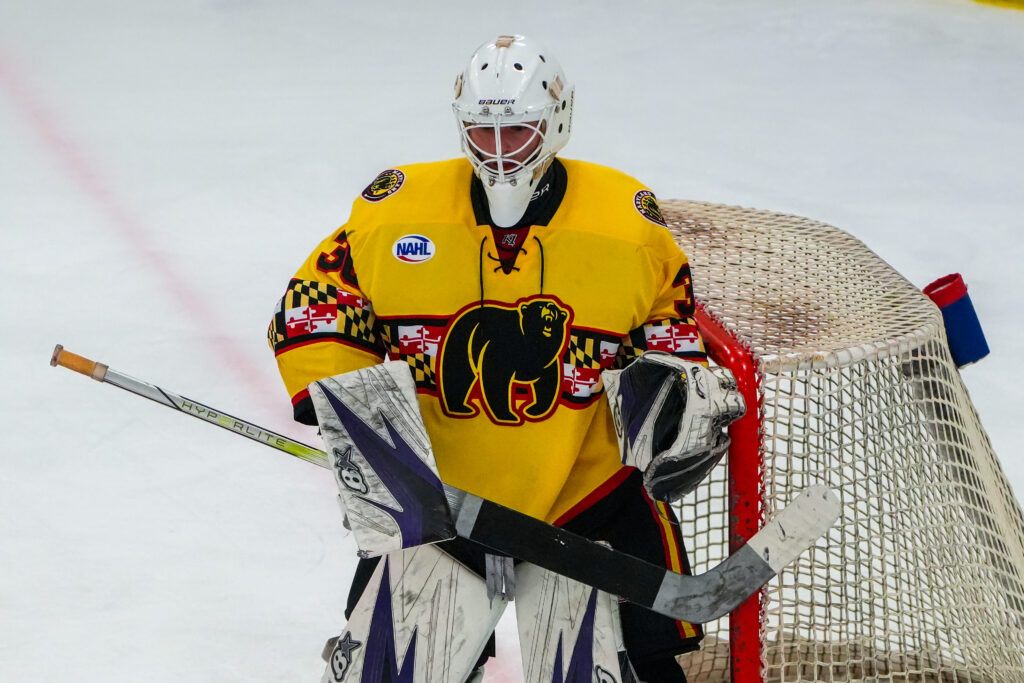
🟡 Yellow/Gold – Energy & Optimism
These colors catch the eye and give off positive energy. Great for youth teams or clubs that want to bring a little flash to the rink.
⚪ White – Clean & Classic
White is a clean slate and a great canvas for bold accents. It’s versatile and timeless—ideal for home or alternate jerseys.
Make Your Colors Count
Choosing your color scheme is more than just picking what looks cool—it’s about building your team’s identity, confidence, and presence on the ice.
At K1 Sportswear, our team of professional designers can help you create a custom hockey uniform that reflects your team’s spirit and makes a lasting impact.
Need help picking the perfect combo? Let’s design something bold together.
🏒 The Season Starts Now—Get Ahead!
Ordering early means you’ll beat the rush and hit the ice looking your best. Contact us using the form below to get started on your custom hockey uniforms and let K1 bring your vision to life.